For the last few years I’ve been tracking my household energy usage: entering meter readings every few weeks into a spreadsheet and (naturally) graphing them.
When my electricity and gas meter were replaced by smart meters, it opened up new possibilities of tracking my household energy usage. I bought a USB to P1 cable, used it to hook up a Raspberry Pi to my smart meter, and wrote some code.
Most smart electricity meters deployed in The Netherlands are equipped with a “P1 port”, identifiable as a RJ11 input port. It allows you to poll usage data over a serial interface.
“Dumb” electricity meters are being rapidly replaced by smart ones throughout the NL, and gas meters are replaced by smart units that communicate (some wirelessly) with the main electricity meter. The main meter is equipped with a GPRS module. This allows your energy provider to remotely monitor your power usage. The P1 port allows you to connect retail monitoring devices like TOON to very granularly monitor your energy usage.
I love what the people at TOON have created and I might buy their product in the future, but for now I figured it would be a nice hobby project to build some software to gain insight into my energy usage.
In the case of my smart meter, new datapoints are being broadcasted every ten seconds. That looks like this:
$ minicom -D /dev/ttyUSB0

1-3:0.2.8(50)
0-0:1.0.0(181109155853W)
.1.1(4530303435303033383938363835313137)
1-0:1.8.1(000837.445*kWh)
1-0:1.8.2(000932.493*kWh)
1-0:2.8.1(000000.000*kWh)
1-0:2.8.2(000000.000*kWh)
0-0:96.14.0(0002)
1-0:1.7.0(00.088*kW)
1-0:2.7.0(00.000*kW)
0-0:96.7.21(00003)
0)
1-0:99.97.0(0)(0-0:96.7.19)
1-0:32.32.0(00003)
1-0:32.36.0(00000)
0-0:96.13.0()
1-0:32.7.0(233.0*V)
)
1-0:21.7.0(00.088*kW)
1-0:22.7.0(00.000*kW)
0-1:24.1.0(003)
0-1:96.1.0(4730303339303031373535393337383137)
0-1:24.2.1(181109155504W)(00996.992*m3)
/XMX5LXXXXXXXXXXXXXXX
The values we’re looking for are:
0-1:24.2.1  : Total gas usage in m3
1-0:1.7.0   : Current electricity usage in kW
1-0:1.8.2   : Total high rate electricity usage in kWH
1-0:1.8.1   : Total low rate electricity usage in kWH
The first thing I did was write a data collector. Initially, as a proof of concept, I simply wrote down the values in JSON format into a text file. Later on, I added SQlite support in order to be able to query the data.
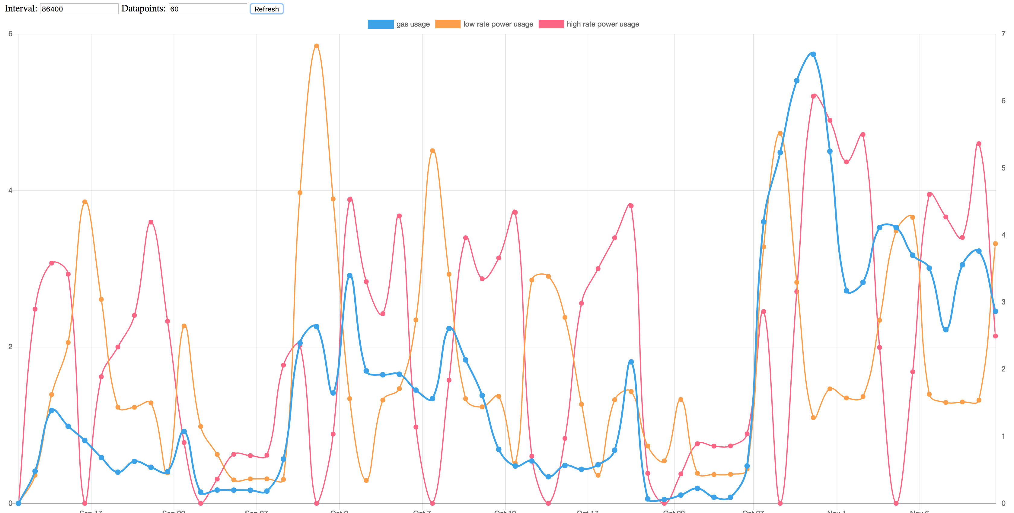
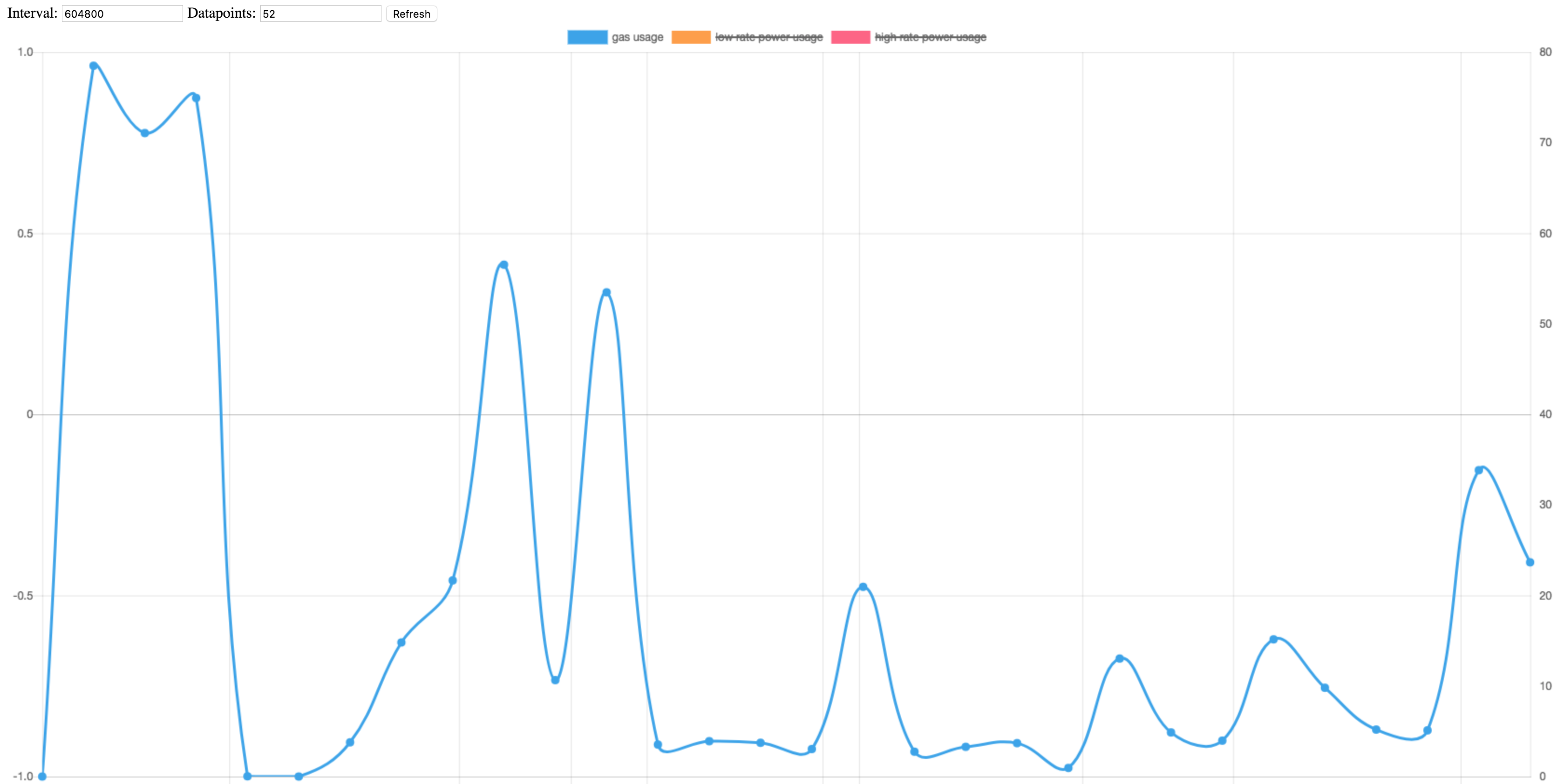
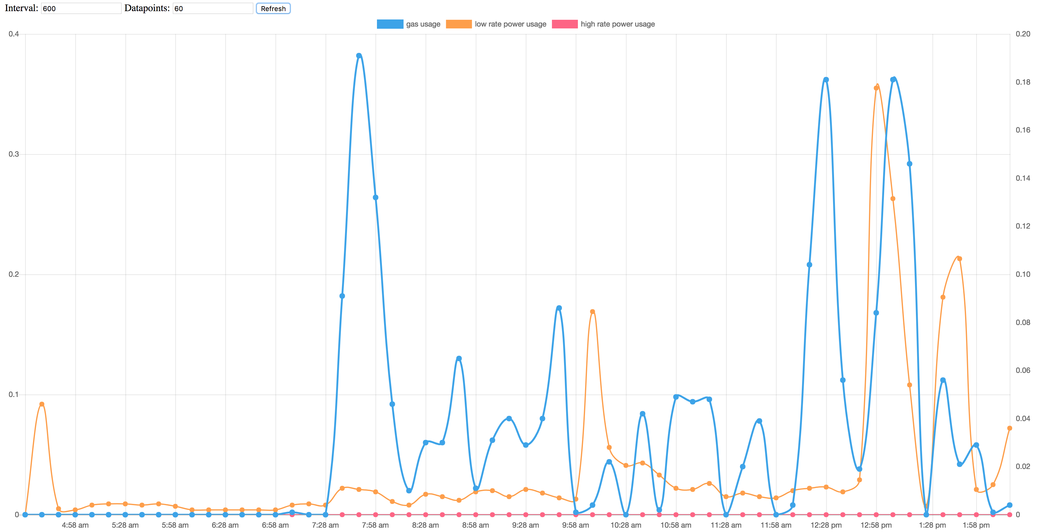
The next step was adding a simple web interface and graphing the data. I used the Flask framework to write a simple web service and the excellent library Chart.js to create graphs.
Current status:
Future plans:
- Intuitive touch interface instead of interval*datapoints input fields
- Add possibility of graphing specific periods
- Aggregate power datapoints
- Add a dashboard with multiple graphs (e.g. weekly, daily and different averages)
- Graph energy production (from PV panels)
- Pattern detection
Like Linus says: “Talk is cheap. show me the code.” Check out the GitHub repository if you’re interested.
Nice. Programming stuff on RPIs is always fun to do.